


A well chosen combination of horizontal and vertical surfaces ensures visual harmony and a coordinated design scheme. So to start with, a few questions: what colour is the existing or planned floor? And what’s the intended interior design style?
Let’s take a detailed look at how the colours of floors and walls should be combined, considering warm, cold or neutral shades, the type of material used, the natural daylight available and the interior design style being aimed for.
This article provides you with ideas, practical inspirations and recommended combinations for every type of floor, with reference to Marazzi collections that are both attractive and practical.
General rules to be followed when choosing the wall colour for use with your floor
Before deciding which shades to use, you should consider a number of key factors: the type and colour of the existing or planned floor, the room’s exposure to natural daylight, the type of furnishings and the visual effect you wish to achieve.
In this section, we’ll look at the main guidelines to be followed to ensure a tasteful floor and wall colour scheme that fulfils both aesthetic and functional requirements.
Choosing between warm, cold or neutral shades: useful advice and inspirations
The choice of warm, cold or neutral shades is one of the most important aspects for defining a room’s visual identity.
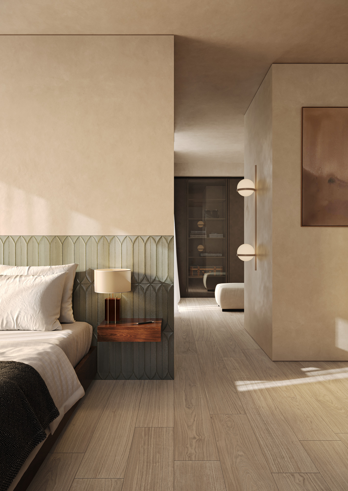
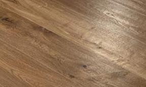
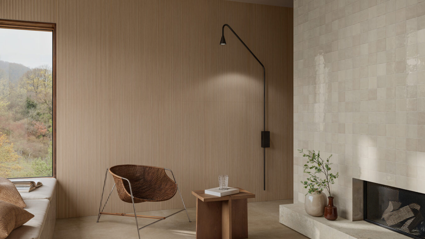
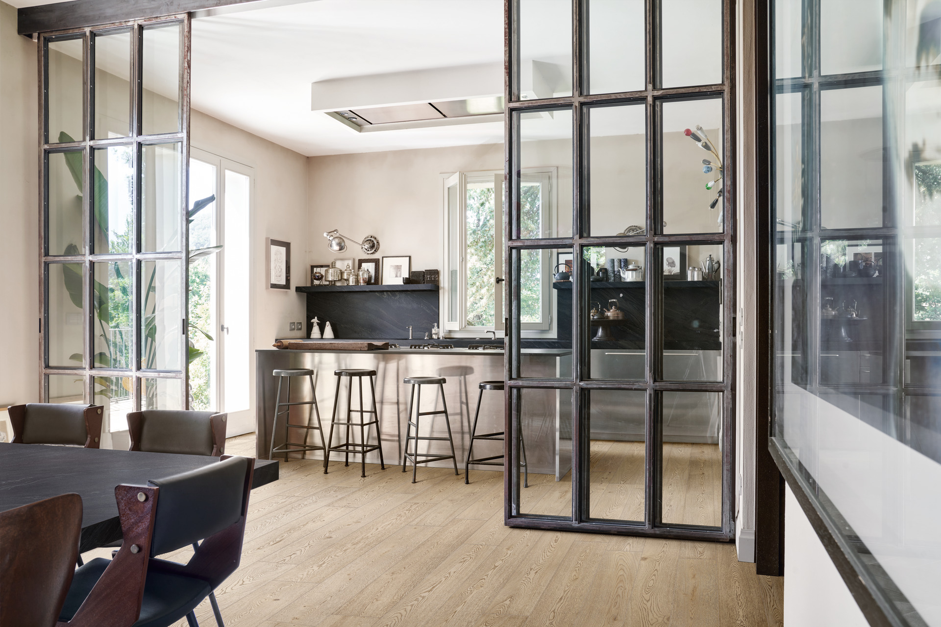
Warm shades like beige, sand, terracotta or mustard yellow convey a welcoming, comfortable impression. They’re ideal for creating friendly, relaxing rooms like a living room or bedroom, and go well with pale wood or terracotta-effect stoneware floors.
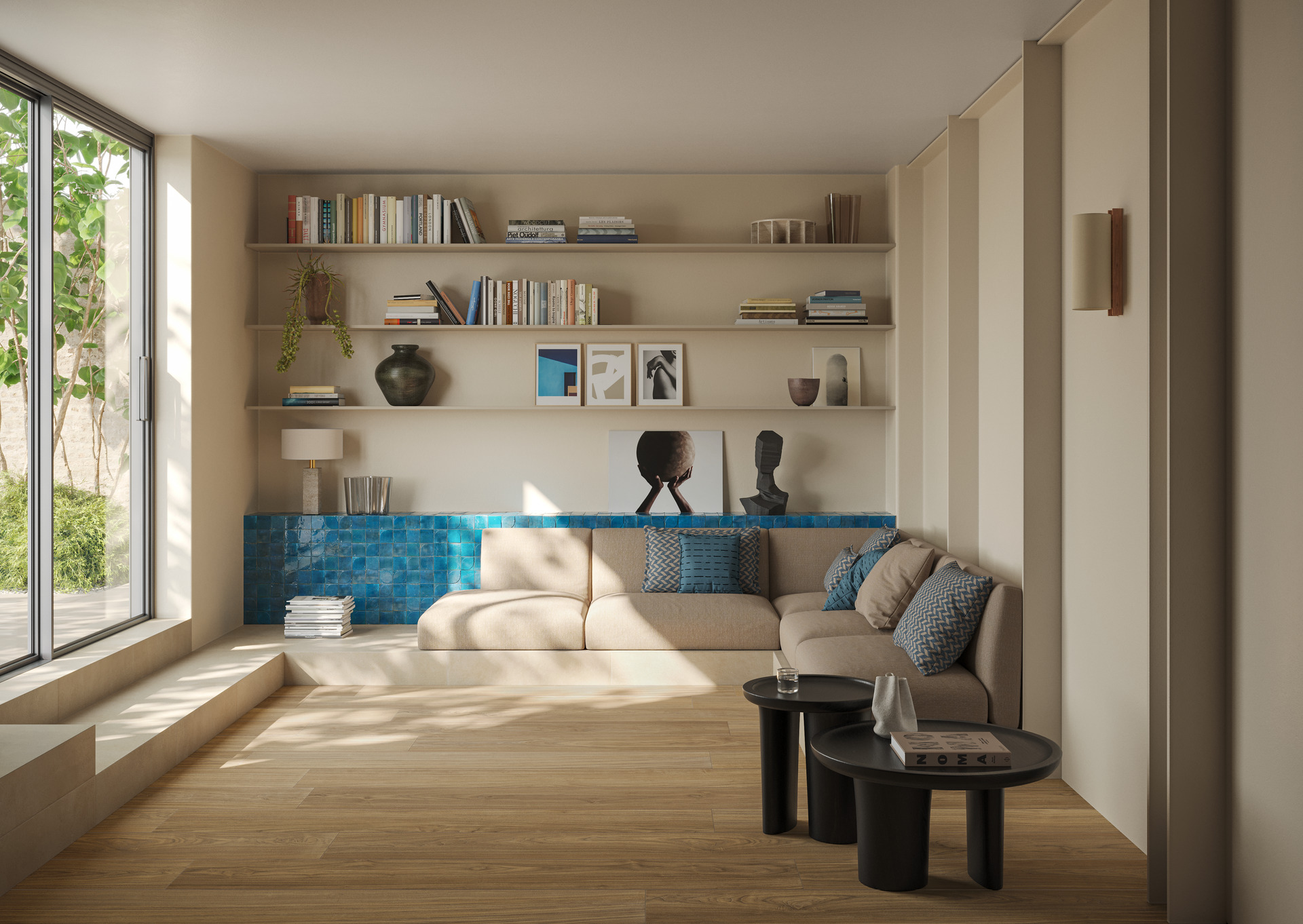
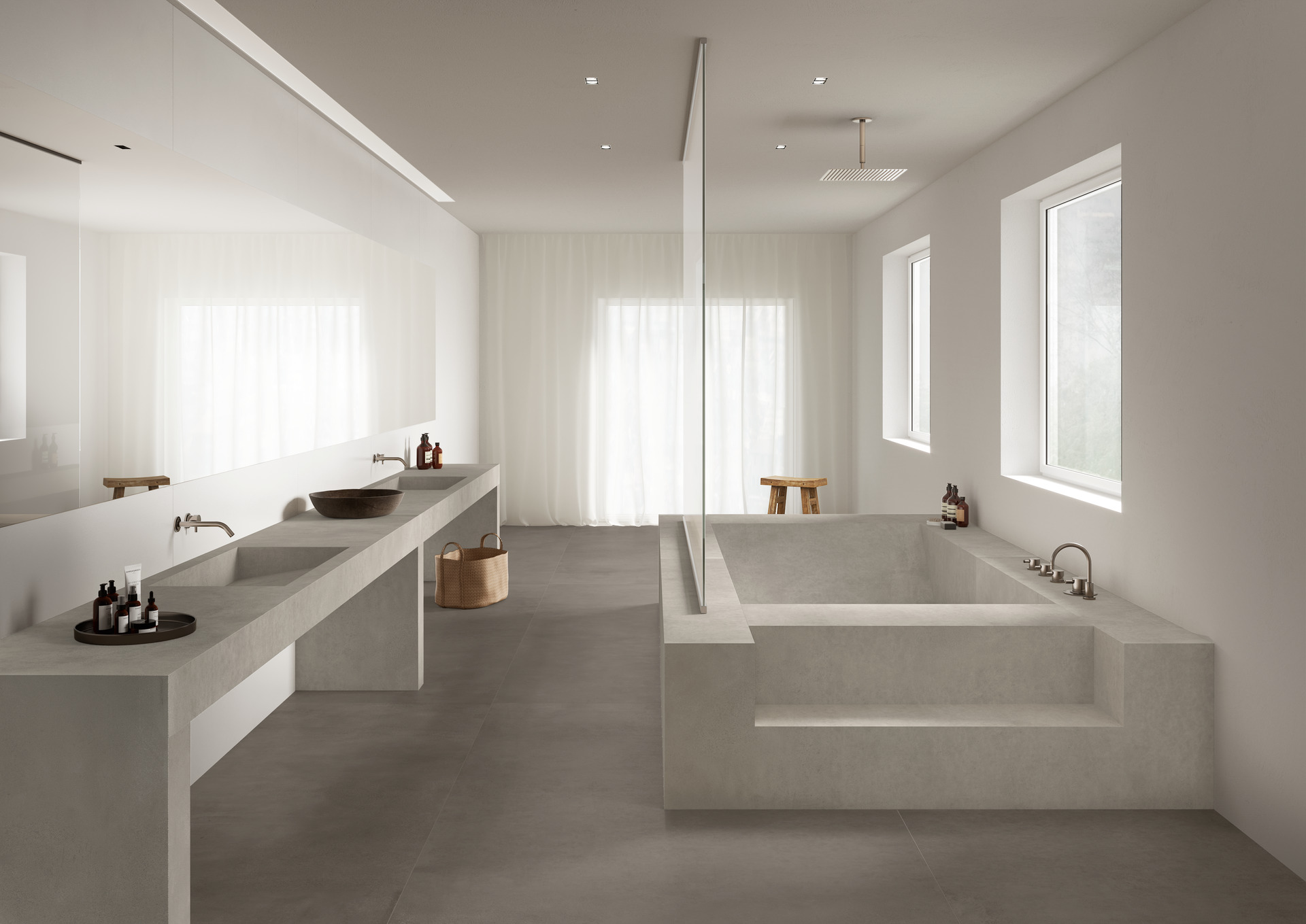
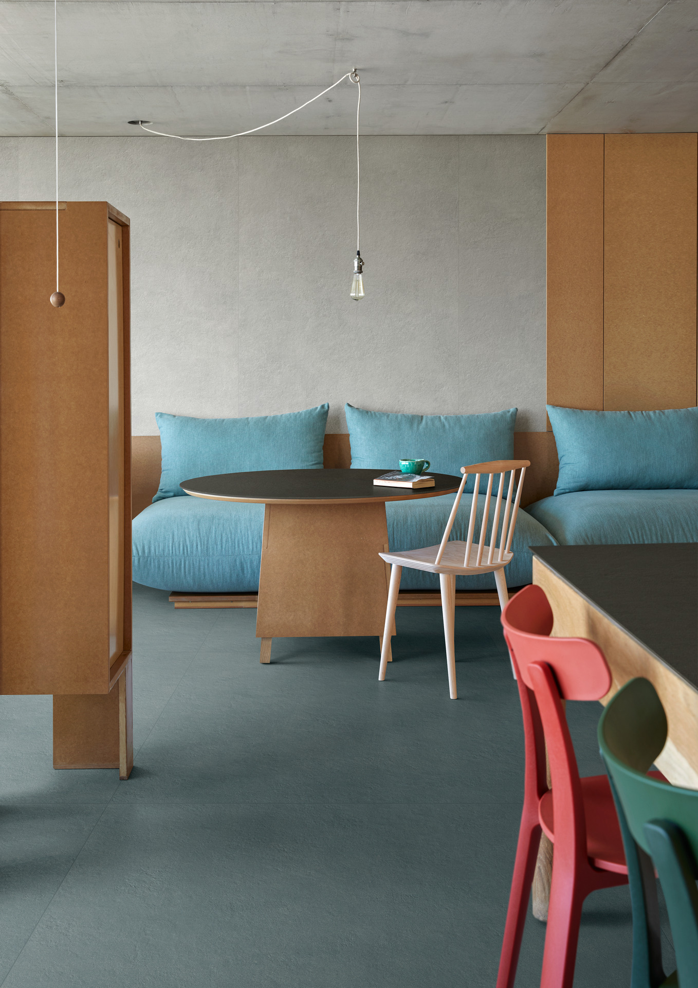
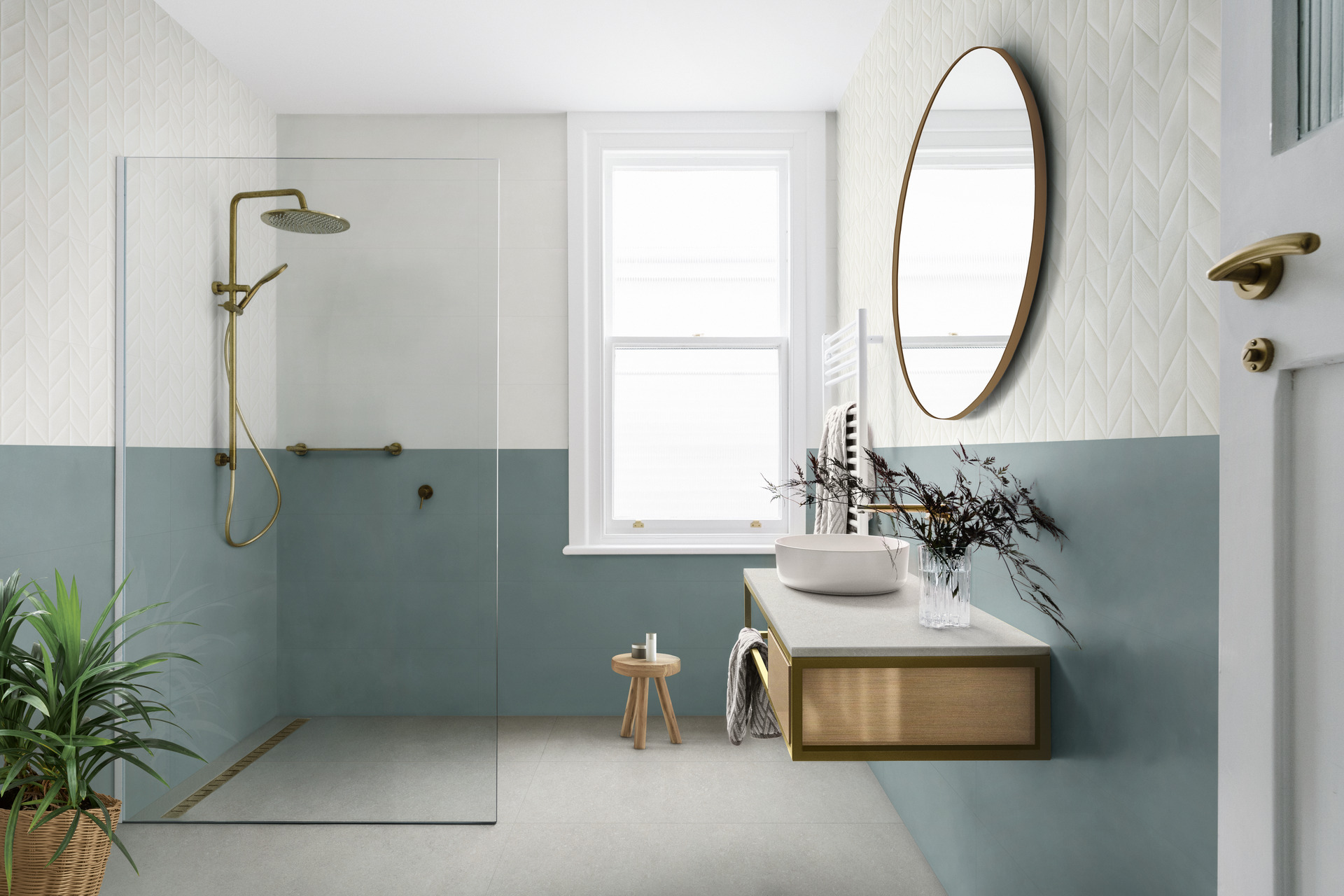
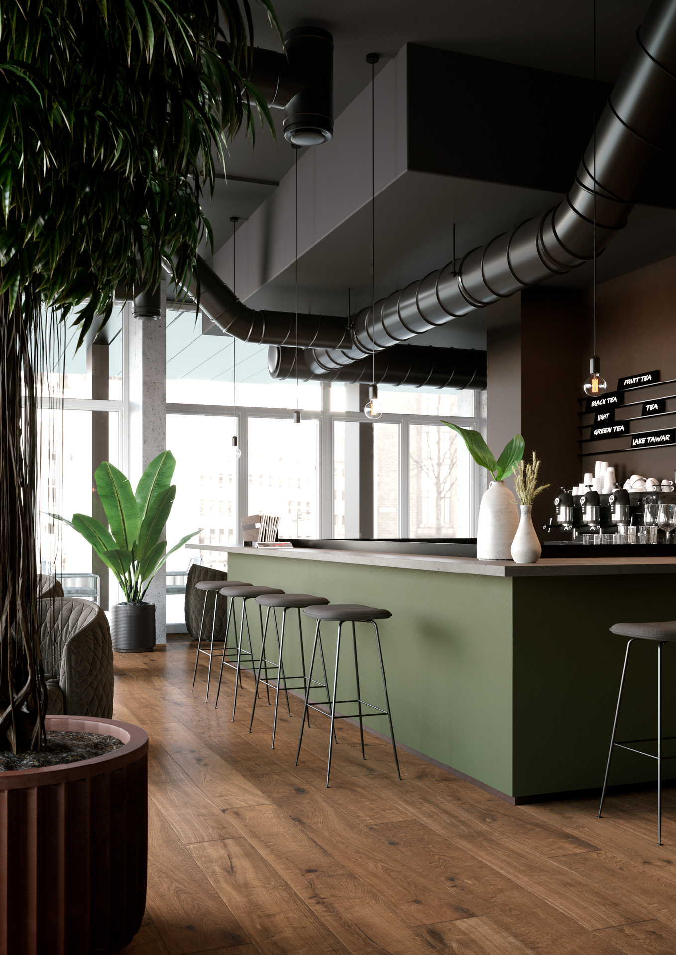
Cold shades like grey, bright blue, sage green or powder blue create a neat, immaculate, modern look. They work particularly well in contemporary, minimal or industrial design schemes, especially in combination with concrete-effect stoneware or dark wood floors.
Finally, neutral shades like warm white, ivory or taupe are a versatile, timeless choice. They provide a luminous, understated background, ideal for tone-on-tone colour schemes or for highlighting natural materials and designer furniture.
Coordinated combinations or strong contrasts? Tricks for effective pairings and avoiding mistakes
In interior design, there are two main approaches when it comes to the relationship between floor and wall colours: matching or a carefully chosen contrast.
Tone-on-tone combinations create an elegant, coordinated effect, perfect for anyone wishing to design an interior in soft, relaxing mood. This approach is very effective in open-plan interiors or living rooms in contemporary style, where visual continuity is a key factor.
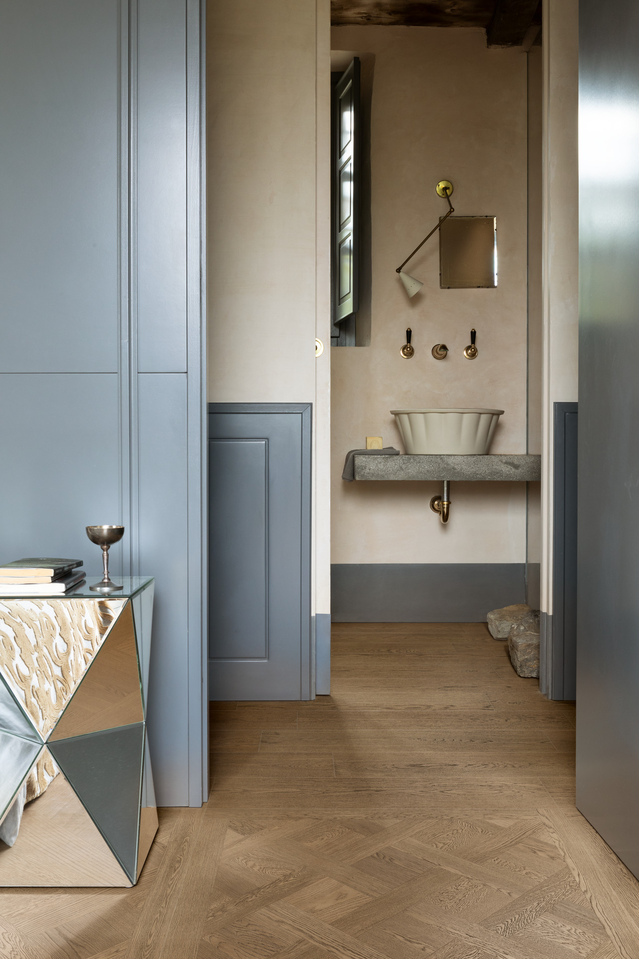
Delicate contrasts offer a dynamic alternative, excellent for anyone wishing to add a personal touch without being too disruptive: concrete grey combined with powder pink walls, or a beige floor with baby blue walls are perfect examples of understated creativity.
For the more daring, sharp contrasts – like a dark oak or marble-effect floor combined with white or ivory walls – generate bold, striking effects.
Ideas for combinations with a grey floor: colours, furniture and elegant solutions
A grey floor is one of the most versatile, modern interior design solutions.
Elegant and neutral, it enables a vast range of colour combinations and adapts perfectly to different styles, from Scandinavian to minimal and from industrial to contemporary. However, since grey is so neutral, it’s important to make sure interiors aren’t too cold or anonymous: it’s essential to choose the colours of the walls and furniture with care to obtain an attractive effect.
Which colours should you choose for walls with a grey floor?
Grey is a perfect background for tasteful, refined combinations: for anyone wishing to create a natural, relaxing mood, sage green is an excellent choice, especially in living rooms or kitchens; alternatively, powder blue introduces a sophisticated, inviting touch, ideal for bedrooms or studies. On the other hand, don’t use the same shade of grey as on the floor, since the overall effect will be flat and dull; it’s better to use other warmer or colder tones to generate variety and add interest to the surface.
One of the best Marazzi collections for creating a beautiful grey floor is Room, an elegant porcelain stoneware with a structured finish that combines to perfection with warm white walls.
Mystone Pietra di Sicilia is also ideal for this purpose, as it provides a stylish reinterpretation of the warm background and veining of Sicilian stone.
Last but not least, Mystone Berici is a contemporary choice with its versatile sizes and tactile surface, an excellent component of subdued or pastel colour schemes.
How to choose the right furniture with a grey floor
Once the floor-wall pairing has been decided, the furniture should be chosen with the same compositional approach to maintain consistency of style. Pale wood, for example, creates an elegant contrast with grey and adds visual warmth to the interior, making it more inviting; in contrast, matt black provides a forceful, modern note, ideal in minimalist design schemes.
Materials like satin metals, glass and matt surfaces help to amplify the contemporary style, while warm fabrics and carpets in neutral shades balance the coldness of grey and introduce soft textures.
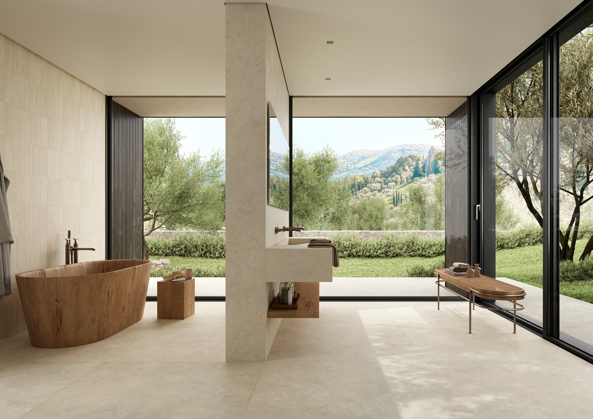
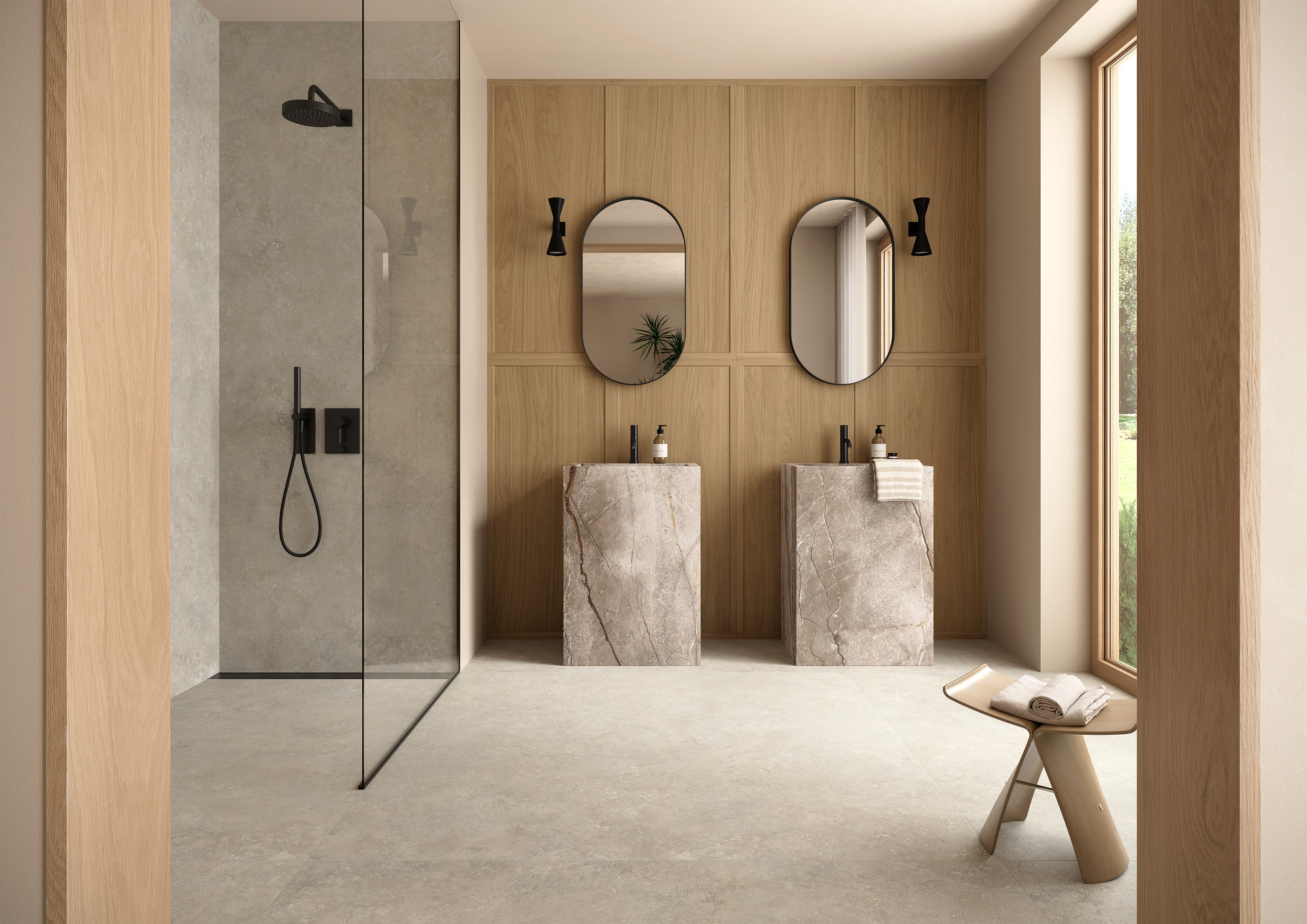
Beige or taupe floors: what colour of wall looks good with a pale or neutral floor?
When you choose a floor in a neutral shade such as beige or taupe, it’s fundamental to create a coordinated dialogue between the horizontal and vertical surfaces. These delicate colours offer great versatility with regard to combinations, but still require care to avoid a result that’s too dull or lacking in personality.
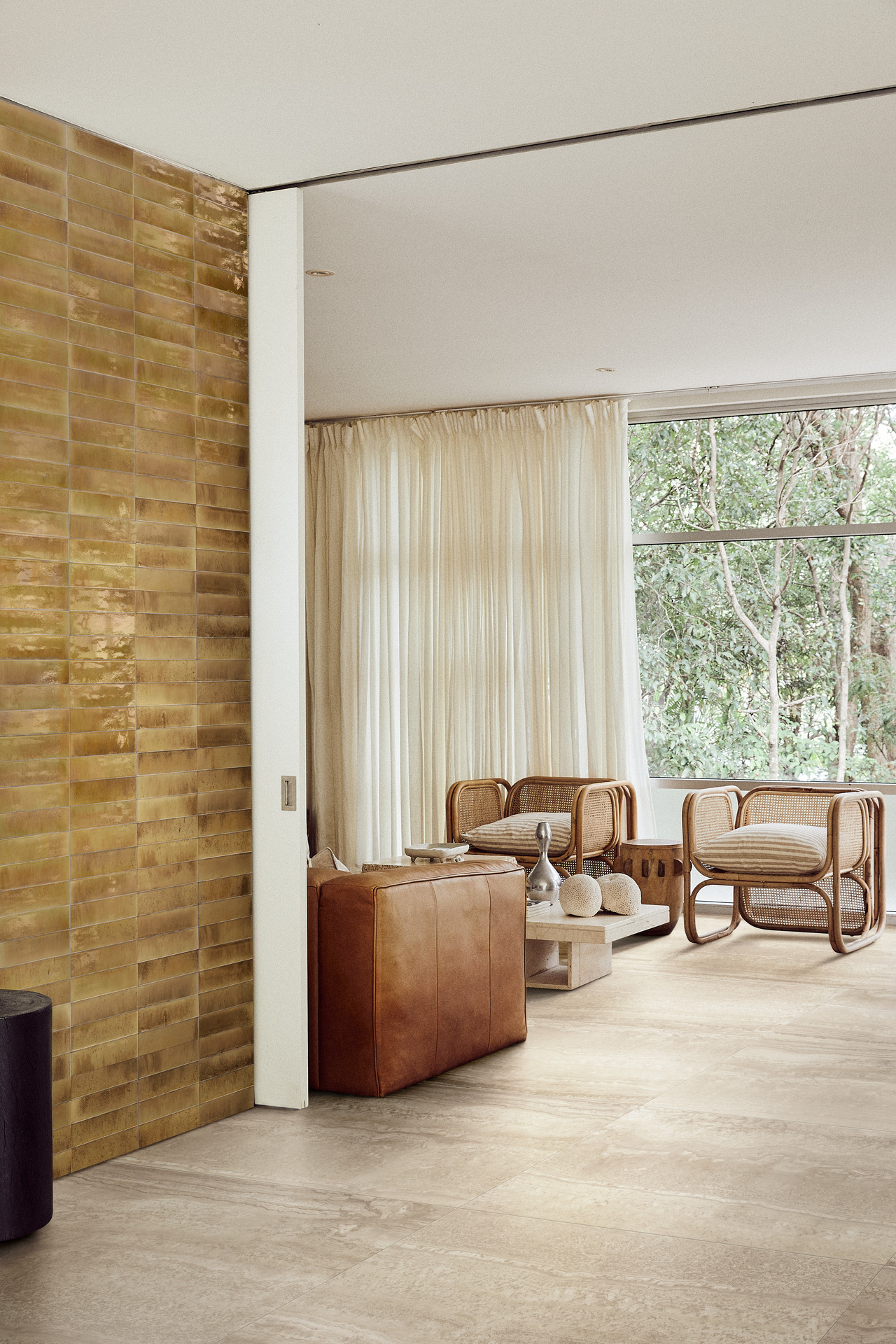
Beige floor: recommended colour combinations for tasteful walls
A beige floor is a luminous, elegant choice, ideal for designing a comfortable interior. To ensure it’s fully effective, the walls can be painted in delicate shades such as warm white, sand or baby blue.
These shades create a tasteful effect that amplifies the natural daylight and is perfect teamed up with pale wood furniture, with the right blend of restraint and refinement. Marazzi collections like Lume or Mystone Berici are ideal for achieving this kind of result, in both classical and more contemporary spaces.
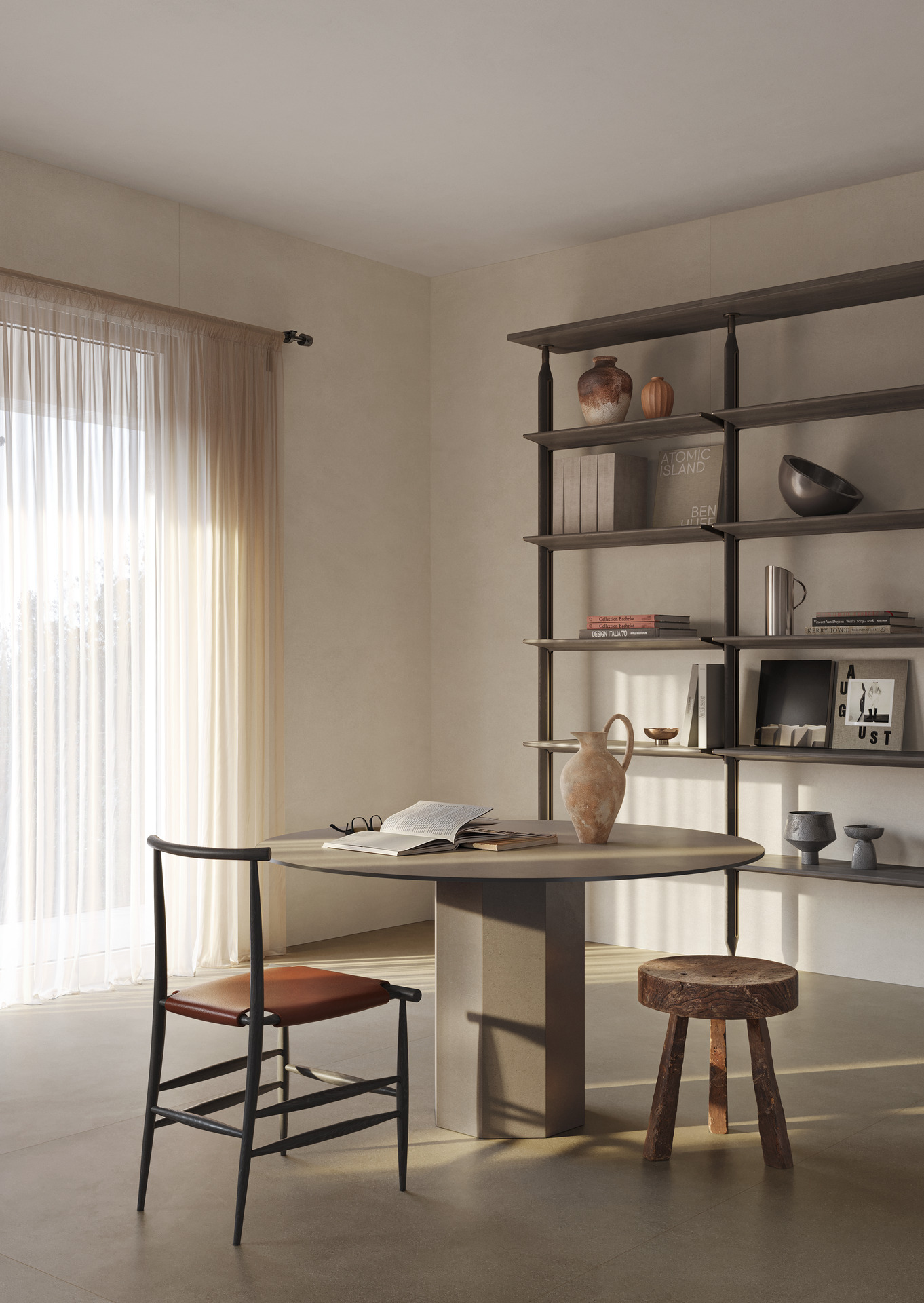
Taupe floor: versatile colour palettes for the ideal combination of walls and furnishings
Taupe is one of the most versatile colours when it comes to interior design: as it’s midway between warm and cold shades, it permits a wide variety of pairings.
The best wall colours for this type of floor include warm grey, olive green and petroleum blue, all shades that give depth to the interior without weighing it down. Furnishings also play an important role in this context: a taupe floor looks great with minimalist furniture, finishes in natural materials and neutral-coloured fabrics.
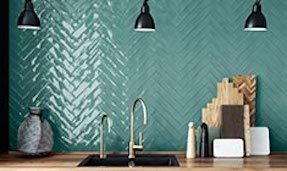
If you’re looking for a more unified, refined design scheme, the Marazzi collections offer perfect wall-floor combinations. For example, Mystone Berici porcelain stoneware floor tiles in beige shade create an elegant pairing with the Flora wall tiles, with their delicate botanical motifs, ideal for decorating the feature walls of the living room. Similar, with its natural, contemporary shades, the Mystone Pietra Ligure collection combines perfectly with the tactile three-dimensional decors of the Terramater series, for a warm, welcoming yet quintessentially modern effect.
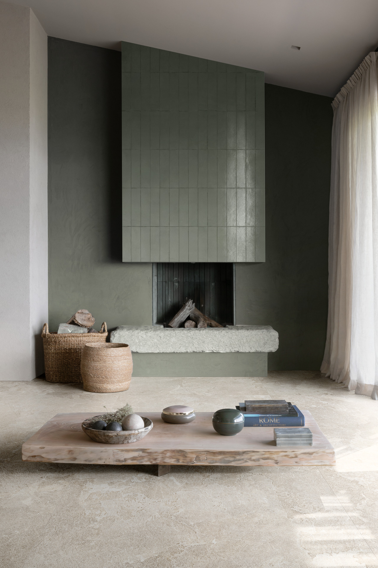
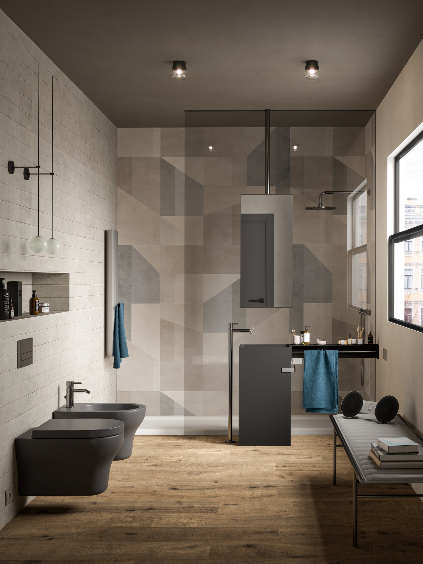
Which colours bring out the full potential of a dark floor?
A dark floor, such as wood-effect porcelain stoneware in wenge, walnut or dark oak shades, is a sophisticated, impactful choice that gives an interior depth and character. To ensure it achieves its full potential, you need to deploy visual contrasts: walls in pale or neutral shades – such as warm white, cream, beige or pearl grey – lighten the perception of space while putting the focus on the flooring.
In large, well-lit rooms you can be daring with colourful walls – in bright or aviation blue, for example – to provide a dramatic touch while retaining a tasteful overall look. For an even more striking effect, the coloured wall can be combined with ceramic surfaces with a soft, tactile appearance, like those of the Resin collection. Its solid colours – which include green and bright blue – are perfect for tone-on-tone design schemes or for generating stylish contrasts with furniture in light and natural shades.
Terracotta floor: the right colour combinations for a part rustic, part contemporary look
Terracotta-effect floors are traditionally associated with the rustic style, but with well-chosen wall colours they reveal a contemporary side to their personality. To maintain warmth but in more modern style, try pairing them with shades like ivory white or pale terracotta. These colours evoke the natural world and traditions of the Mediterranean, but with a touch of visual lightness that gives the interior greater freshness.
White helps to make a room appear larger and to reflect the light, while a pastel shade like sage green introduces a soft note that suggests vegetation, ideal in country-style kitchens or bare-beamed living rooms. Last but not least, pale terracotta creates a refined, tasteful continuity of colour, especially when combined with natural wood furniture or hand-crafted pottery.
These combinations are facilitated by the Lume and Slow Cold collections, which offer authentic, versatile finishes able to adapt to both traditional contexts and more minimal spaces.
Which are the most common colour combinations when choosing floors and walls?
Choosing the right floor and wall combinations is a crucial step in designing a tasteful, stylistically consistent interior. In fact, colours not only affect our perception of the room’s luminosity and size but also help to define the character of its interior design.
This said, how many colours can be combined in one room?
Generally, it’s best not to use more than three colours in one room: one dominant (usually the floor), one contrasting (walls) and one for highlights (furniture, fabrics or ornaments).
Complying with this rule maintains visual harmony and design unity, avoiding the patchwork effect created when too many unrelated features are put together and the result lacks coherence.
Evergreen neutral combinations
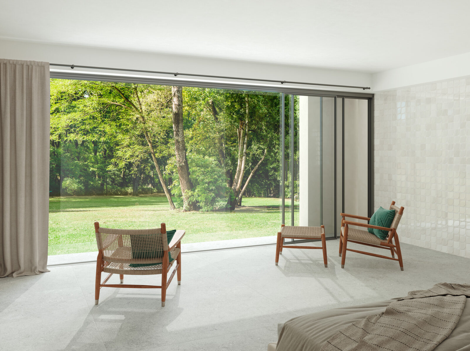
Neutral colour schemes are amongst the most popular, since they’re elegant, simple and highly adaptable.
As already mentioned, a grey floor teams up perfectly with warm white or taupe walls: the structured surfaces of the Room collection are the ideal choice for modern, minimalist interiors.
For anyone who prefers warmer shades, a beige floor can be combined with sand-colour or cream walls, for an inviting, sophisticated effect. Mystone Tivoli tiles are the ideal basis for homes in country chic or contemporary classic style, especially when paired with pale wood furniture.
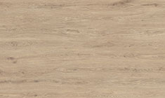
Last but not least, for a light-filled, Scandinavian aesthetic, the light-coloured parquet effect combines to perfection with pearl grey or ivory white walls. The Vivo collection offers a realistic pale wood look and is equally ideal for small rooms or well lit open-plan interiors.
Tasteful contrasts: chiaroscuro dialogues between walls and floors
If you’re looking for a dramatic effect, you can’t go wrong with the contrast between dark and light surfaces: a dark wood-look stoneware floor covering like Vero is strikingly elegant if combined with warm white, cream or ivory walls.
Conversely, a light-coloured floor – pearl grey or beige – can be emphasised with walls in deep colours like midnight blue, forest green or anthracite.
Tone-on-tone walls and floors
Tone-on-tone combinations are an attractive strategy for creating tasteful interiors with a relaxing look. One example is the pairing of a taupe floor with warm grey walls, a very common choice in open-plan living rooms: Marazzi’s Mystone Pietra di Sicilia and Slow Cold collections are perfect for anyone wishing to achieve visual continuity.
Another successful coupling is concrete grey with pearl grey or powder pink walls, ideal for industrial-style interiors with a softer touch: with its natural stone effect, the Mystone Tivoli collection brings out all the beauty of this type of colour scheme and is an excellent pairing with glass, steel or black metal furniture.
Combinations with natural and pastel colours
Lovers of natural and Mediterranean moods can opt for terracotta tile or terracotta-effect stoneware floors, together with sage green or butter white walls.
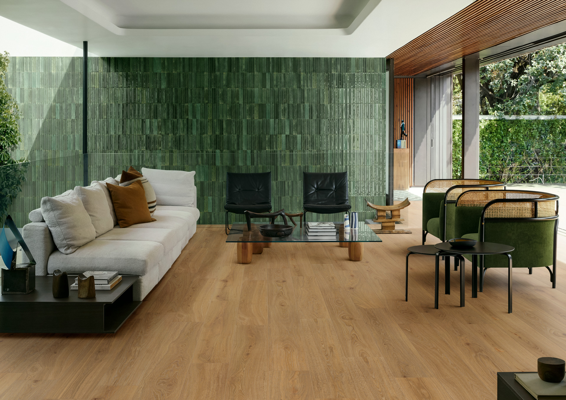
The dark parquet effect also works very well with olive green or petroleum blue walls, creating an inviting, elegant and very individual interior: this combination is perfect for studies, libraries or cosy bedrooms. The Nobilis or Intrecci collections provide this warm, tactile effect, with all the convenience of stoneware.
Choosing the right floor and wall colour combination isn’t just an aesthetic issue; it’s a real interior design project, that involves the room’s perceived size, its convenience and its visual comfort. Constructing coordinated colour schemes, making the most of the natural daylight and matching your materials are the key to creating attractive interiors tailored to every need.
Explore the Marazzi collections to find inspiration and create perfect floor-wall combinations, thanks to a complete range of surfaces, textures and finishes for every style.