


References to Venice’s history combine with the mood, part rock and part Great Gatsby, of the Chef’s Milan locale. We are in Chef Alessandro Borghese’s new restaurant in the historic building that houses Venice Casino, where The Top porcelain slabs combine opulence and tradition with unbeatable performance
Alessandro Borghese’s restaurant is located within the historic Venice Casino building. It is a sophisticated yet comfortable locale, with every tiniest detail carefully designed to provide a complete experience. There are five rooms for different encounters with fine food and wine, from the gourmet restaurant to the bistro with pastry counter, from the bar to the patio and the wine cellar. The design is based on an interpretation of the spirit and history of the 16thC palazzo, with stylistic references to Chef Borghese’s Milan restaurant. “Our starting point was the identity of Ca’ Vendramin Calergi itself”, explains Alfredo Canelli, an architect with Alessandro Borghese’s food consulting and communication firm AB Normal. “It was the home of a Bourbon Duchess who was the lover of Canaletto. We therefore decided to evoke the famous Venetian painter by means of his keynote colours – pink and light blue – which are mixed with those of the Milan restaurant. We decided to reference the Milan locale through its materials, although there the main theme is the ‘golden age’ of The Great Gatsby. For example, brass, which denotes the 1920s, is used here in small interior design details such as on the counters or in the joints in the authentic Venetian Terrazzo which mark the dividing lines between different functions such as the restaurant, bistro and bar.
Black, the dominant colour of the Milan interior, appears here in the tops of the counters and tables and in carefully chosen furnishings. We also repeated the use of boiserie panels on the walls in Venice, here in Canaletto colours, which reach beyond the edges of the wooden panels. The interior design is a complex mix of only partially defined details, intended to intrigue and fascinate guests. The Milan and Venice restaurants are two sister projects, created by the same designers but each with its own character. They both aim to make guests feel at home, by being welcoming and offering a kind of luxury based on feelings and not exclusiveness.”
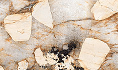
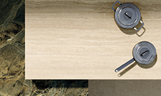
Porcelain stoneware is widely used in the table- and counter-tops: The Top Marble Look Golden White, Verde Aver and Elegant Black were the chosen variants, with Elegant Black also covering tops and sides of the counters. Each slab was specially shaped for its specific purpose. This marble effect offers amazing resolution and variety in its vein patterns and details, and beautifies the interiors with the benefits of convenience: “We chose porcelain stoneware for the tops,” Mr Canelli continued, “so we could avoid using table-cloths and make it easier to lay the tables, with coloured napkins. The material’s toughness was another major consideration: in some show-cooking sessions Chef Borghese has actually cooked on the tops with a blowtorch – it’s truly easy to clean, hygienic and indestructible.”
The show-kitchen is visible even from the garden. The iridescent, timeworn look of the Corten steel-effect floor tiles – Mineral Corten Brill collection, in the square 60×60 cm size – contrasts with the glossy steel of the professional cooking appliances and the wall coverings in 6 mm slimline thickness porcelain stoneware (Grande Marble Golden White, 120×240 cm size). “These large slabs evoke historic Pre-War kitchens which were finished entirely with marble, the lovely, almost poetical kitchens of southern Italy, battered by years of use and dedicated to the pure pleasure of food. Due to architectural constraints, the Venice kitchen is long and narrow; it is accessed through a gilded central archway that evokes both the Venetian arcades known as “sottoporteghi” and the gold of St. Mark’s Basilica.”
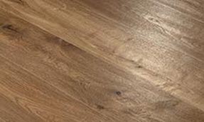
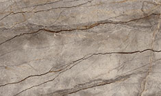
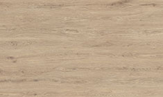
Last but not least, the washrooms: “the place where people ‘commune with themselves’ and where they all take selfies”, Mr Canelli points out. They actually contain the finest paintings by the young artists whose works are displayed in rotation in Chef Borghese’s restaurants. “The washrooms are as important as the kitchen, and their every detail must express luxury.” They are finished with floor-to-ceiling slabs of Grande Marble Look Sahara Noir (160×320 cm), contrasting with The Top Marble Look Calacatta Extra on the washbasin countertops and for the washbasins themselves, in custom-shaped pieces that establish a dialogue with the various colours and the rich shade variation. For a warmer impression and for continuity of colour with the Corten steel-effect of the kitchen and the antique Venetian Terrazzo of the other rooms, the bathroom flooring is in the wood look of the Vero Quercia collection, using plank tiles of 22.5×180 cm.
“We aim to promote a greater awareness of Italian excellence, also thanks to input from our partners. Apart from Marazzi, who have provided us with “functional beauty”, we chose Cierreesse for the fine furnishings and Buzzi & Buzzi for the restaurant’s internal lighting, which is warm, intimate, comfortable and even health-giving, as it is able to purify the air.”